While Config 2023 is happening, I am researching icons and symbols. Every time we search for ways to learn, we find out there is so much deeper in everything around us. Just like in Config, one of the designers, Rasmus Andersson (playbit) mentioned how all the details just on a tap from 2 lines. I am not saying this right. Here is what happened.
In my home library, I had these books on icons/symbols:
- Universal Principles of Design
- Infinite Icons
- Logo Design Love
The different kinds of “signs”:
- Symbol – The connection between them must be culturally learned. Numbers and alphabets are good examples. There’s nothing inherent in the number 9 to indicate what it represents. It must be culturally learned.
- Icon – direct imitation of the object or concept.
- Index – An Index shows evidence of what’s being represented. A good example is using an image of smoke to indicate a fire. OR The location of an airport uses an image of an aeroplane.
When to use what? This is the question I ask. Signs got categorised into 3 groups: icon, index and symbol Charles Sanders Peirce (1839-1914). The main difference between each broad category of signs is the quality of the physical relationship between the signifier and the signified.
Henry Dreyfuss’ Symbol Sourcebook includes four iconic representation types. The Universal Principles of Design also cover these types in detail.
- Similar – visually similar to the action, object or concept. The sign for the “right turn” indicates there is a turn, so you should slow down.
- Example – images or things that exemplify or are commonly associated with an action, object or concept. e.g. The aeroplane on the sign is the location of the airport.
- Symbolic – Symbolic – Well-established and easily recognized objects. e.g. a Lock to indicate a function of control of the door lock in a car.
- Arbitrary – Culture and industry standards. The relationship has to be learned.
We are in a cult where we do a lot of copying and pasting. I did the same, went online and searched on the buyer journey by these keywords:
- awareness > 2. interest > 3. desire > 4. action > 5. advocacy

What am I looking at? How may I get these icons made better? Research for more and test if others read what I read? Does it matter when we have words with these icons? What are the icons doing here? Simplify?!!
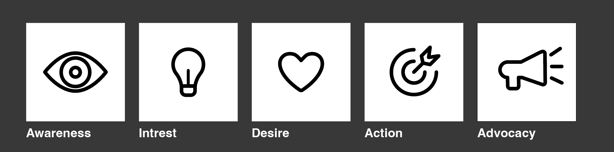
- Object – An Eye
- Action – To See or View is an act of seeing, watching, or taking a look.
- Concept – Aware or alert, awake, inspecting, looking, noticing, and perceiving.
- Object – A Lightbulb
- Action – Light on / off
- Concept – New idea, electric power and lighting. It often represents a sudden insight, knowledge, or thought in general – basically anything “bright” in the metaphorical sense.
- Object – a Heart
- Action – Love / Desire
- Concept – To desire, to wish and want. To love is to have, we feel the having, the closeness, the belonging. The wanting is fulfilled and there’s a security in knowing that it won’t leave – that it’s safe and stable.
- Object – Target board
- Action – Goal / Action
- Concept – An action to drive the need for the product that helps the user from doing something for solving a problem.
- Object – Speakerphone
- Action – review of a product and
- Concept – Advocacy, public support for or recommendation of a particular cause or policy.
If this is any better, I wonder… when drawing out an icon, the 3 words to ask myself on how this links.
