✍️ Intro
I’m not an insurance professional.
I’ve never worked for MPFA or a trustee.
But I’ve contributed to MPF for over 20 years — and like many others, I’ve often felt unsure about what’s happening with my retirement savings.
That led me to ask:
“What if the MPF experience could be simpler, clearer — even empowering?”
So I spent a few days researching, mapping, and prototyping.
This post shares my independent design case study, which was built entirely with curiosity, Figma, and some help from AI tools like ChatGPT and Stitch (Beta) by Google.
🎯 My Goal
To create a mobile-first prototype that helps users:
- Understand their full MPF history
- View all their accounts in one timeline
- Take actions like consolidating accounts or switching funds
- Learn about MPF fees, rights, and strategies — simply
All while respecting privacy and making no assumptions about user knowledge.
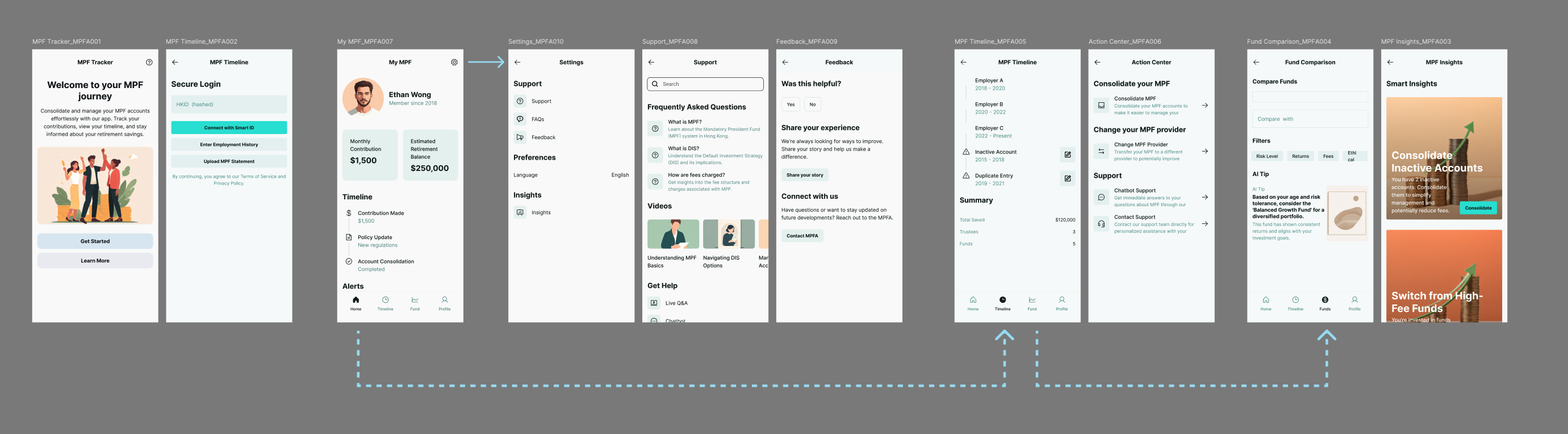
🔍 Behind the Screens
The image above maps out a full prototype journey:
1️⃣ Welcome & Login
A friendly, simplified introduction to the MPF platform. Users can log in securely via Smart ID, or begin with manual uploads if they’re unsure or unregistered.
2️⃣ Personal Dashboard
Once inside, users see their total MPF balance, a timeline view, and alerts if data is incomplete.
3️⃣ Settings & Support
Users can access FAQs, live chat, and video guides — all designed to explain MPF terms, fund options, and fee structures without financial jargon.
4️⃣ Timeline & Action Center
Here, users can:
- View their employment/MPF history
- Identify missing or duplicate records
- Take action: consolidate MPF or change trustees
5️⃣ Fund Comparison & Smart Insights
Visual tools show which funds they’re using, compare fee rates, and suggest:
- Switching from high-fee to low-fee funds
- Consolidating inactive accounts to reduce loss
All insights are tied to user data, not just generic advice.
💬 Why I Did This
This isn’t a client project or a startup plan.
I wanted to see it done better — not for everyone, but for people like me.
MPF isn’t broken — it’s just hard to understand.
As a UX designer, I believe systems can feel more human.
This case study was my way of learning, dreaming, and contributing something new.
🛠 Tools I Used
- ChatGPT – UX strategy and copywriting prompts
- Stitch (Google Beta) – For early UI explorations
- Figma – Full visual design
- Graphviz – Mapping backend data workflows
- WordPress – To document and share
📚 What I Learned
- Users often want to engage with systems — if they’re made more welcoming
- Even financial tools can feel personal, not transactional
- AI tools are excellent when guided by strong user-centred thinking
- You don’t need to work in insurance to ask meaningful questions about it
🚀 What’s Next?
This small project made me wonder:
- Could we create a design system for Hong Kong’s public tools?
- What would happen if we applied UX thinking to all insurance and retirement systems?
- Could AI help unlock decades of fragmented data — and reveal ways to do better?
I don’t know all the answers.
But I know this kind of design work deserves more attention, not just for innovation but also for trust.
🔚 Final Words
“There’s a lot going on out there in tech — but sometimes, slowing down to explore one real-world problem can teach you the most.”
Thanks for reading.
If you have thoughts, ideas, or just want to jam on how to make public systems more human, I’d love to connect.
